Homerun MLB: Catch and Collect
Client: Major League Baseball (MLB)
Industry: Sport Entertainment
Roles:
UX Designer, UX Research, Visual Design, Mockup, Prototyping and Testing, UX Writing
Video Editor, Sound Engineering, Trailer/Commercial Producing
Team Member(s):
Adriene Montalvo, UX Designer
Gitel Saks, UX Designer
Neha Chhabra, UX Designer, Sound Engineer
Selin Özay, UX Designer, Video editor
Tools: Adobe Photoshop, Adobe Illustrator, Adobe XD, Miro, Figma, Spark AR, Amazon Alexa
Duration: August 2021-September 2021
Background
Major League Baseball (MLB) is a North American professional baseball organization founded in 1903 after a merger between the U.S. professional baseball leagues, the National League (NL) and the American League (AL). It formed the technology department, MLB Advanced Media, in 2020. The MLB Advanced Media focuses on future video game and virtual and augmented reality development. Their goal is to provide fans excitement of baseball through cross platform and immersive virtual and and augmented experience and captivating baseball stories captured by their products.
Overview
MLB Advanced Media sought a UX experience to increase the fans’ interest in baseball by providing individualized, immersive experiences across diverse digital platforms. Developing video games and augmented and virtual reality apps is one method they used to achieve this goal.
The two main problems that MLB Advanced Media wanted to resolve are:
Fans need an engaging MLB experience that extends past a live game or inside a stadium. Older enthusiasts missed the sportsmanship, energy, interaction, and community that the traditional stadium previously provided. Unfortunately, the COVID-19 pandemic limits the stadium experience for long-term baseball supporters.
Digital card collecting lacks the tactile experiences and memorabilia that the physical card collecting has, despite the virtual card activity being a sought-after $575 million marketing strategy in North America as of 2020.
Our product, MLB: Catch and Collect, solves the listed problems. With our MLB: Catch and Collect mobile application, users can bond with their community and have fun both on and off the stadium by collecting virtual cards. This application solves the low engagement with the MLB community while making long games more fun and interactive.
Features of the MLB: Catch and Collect application are:
Scannable QR codes to permit users to play mini-games to obtain virtual baseball cards and gain more bonuses and rankings as they capture more cards. These codes are available at stadiums, sponsor websites, and other forms of advertisements associated with MLB.
AR experience of watching their favorite baseball players' miraculous events and taking pictures with the athletes of their choice.
Virtual cards that resemble the traditional physical cards that the older generation collected and traded, appealing to more senior fans' interests.
We designed the UX experience and created the trailer for MLB: Catch and Collect within the deadline of 6 weeks using biweekly sprints.
Process
As shown in Figure 1, I divided the UX project into 4 phases: Discover, Define, Develop, and Deliver.
Figure 1: The Double Diamond Model
Figure 2: Project Timeline Part 1
Figure 3: Project Timeline Part 2
2.2 Creating a Journey Map
Phase I: Discover
1. Problem Statement
We developed the following problem statement, based the MLB Advanced Media’s digital transformation goals and financial loss due COVID-19 social distancing.
“Due to COVID-19 social distancing, MLB fans stopped viewing the baseball games in-person and meeting fellow sport enthusiasts and baseball players within their communities. Consequently, MLB lost revenues at stadiums and live games, especially the vending of physical baseball cards and athlete-related merchandise.”
2. Conceptualizing the Product
To conceptualize our product, we created the project's timeline, journey map, user flow, premortem, completive analysis, and SWOT analysis in Miro. They are assessable at https://miro.com/app/board/o9J_l3N-p8A=/.
2. 1. Creating the Project Timeline
We outlined the required documentations for the 6-week duration in the 2-part timeline shown in Figures 2 and 3. The deliverables are categorized based on urgency, importance, status of completion, and areas of activity. The link to the timeline is https://miro.com/app/board/o9J_l3N-p8A=/.
Figure 4: Journey Map. Link to Journey Map is https://miro.com/app/board/o9J_l3N-p8A=/.
We created a customer journey map in Miro to show Michael Batsky, the persona, responding to the QR code displayed on the jumbotron. Batsky is a tech-savvy, early adopter baseball fan; he sees the code on the digital screen and scans it. Later, he purchases a collector card and downloads the MLB: Catch and Collect app. He searched the application to find more cards. For cards he cannot physically obtain, Batsky trades his possessions for them. Finally, he invites his friends to join him on the app after enjoying the experience. The line represents the persona's emotions. Positive feelings increase the line height, while adverse reactions lower the streak. Batsky expects to learn about baseball history and engage with other baseball fans whether he is in the stadium or not.
The improvement opportunities were selling and trading basketball cards, maintaining/increasing fans, and commercializing associating companies. MLB needs help from their customer support, web, and marketing team to ensure the success of the QR codes and cards.
The pain points and their respective solutions are:
Pain Points: Wishing to engage online with the baseball communities and collect cards. Solution: Cards with QR codes.
Pain Points: Not knowing what the QR codes are. Solution: Provide a brief description of the QR codes and their usage.
Pain Points: Needing to explore the app to find cards. Solution: Have a tab for information and actions relating to the cards and add a search bar to find cards quicker.
Pain Points: Not physically getting the card. Solution: Online selling and trading of cards.
2.3. Creating User Flow
The link to the draft and proposed user flows are https://miro.com/app/board/o9J_l3N-p8A=/.
Figure 5: Before: Draft of the User Flow.
We created a rough draft of the user flow. We rejected the initial blueprint because the user story was overcomplicated, making the project to demanding to design. After signing into the MLB app, the user can view his profile, scan QR, and get a baseball ticket. While getting the pass, the user has the option of sharing extra tickets and reserving parking spots. Since getting tickets is unrelated and deviates from the narrative of using QR codes, we removed it from the user flow. Later, we simplified the design into the proposed version.
Figure 6: After: Proposed User Flow.
The proposed user flow focuses on the user’s ability to view his profile and find and scan his QR codes to view upcoming challenges, events, info provided in the encryption, and the local map. The user can also view his card collection in his profile after obtaining baseball cards. The path that users may have frictions or errors (purple) is the path where the users need to scan and read the QR codes. If the QR code is damaged or not stored in the app’s system, the portion of the application will not work.
2.4 Creating a Premortem
Figure 7: Premortem. The link to the Premortem is https://miro.com/app/board/o9J_l3N-p8A=/.
Our three biggest potential problems were:
Problem: The QR codes not working. Solution: Having technical/engineering teams solve the scanning errors.
Problem: The users may not know or be interested in QR codes and getting rewards. Solution: Making QR code announcements through promotions/marketing events.
Problem: The users being unable to express our ideas and designs to the client. Solution: doing repetitive user testing to avoid pain points.
2.5. Conducting a Competitive Analysis
We conducted two distinct competitive analysis based on the functionality and visual elements of our proposed product. For the usability analysis, we compared the user demographic, collector's items, pay walls, and forecast of MLB's Topps, MLB Candy Digital, Pokémon Go, and NFT's OpenSea. We weighed up the similarities and differences in user demographic, social media partners, telecommunication, tech partners, cryptocurrencies, partnership, and AR/VR news for MLB, National Football League (NFL), and National Hockey League (NHL). The link to the Competitive Analysis is https://miro.com/app/board/o9J_l3N-p8A=/.
Figure 8: Competitive Analysis Part 1
Figure 9: Competitive Analysis Part 2
2.6. Conducting a SWOT Analysis
We created a SWOT (Strengths, Weaknesses, Opportunities, and Threats) analysis to determine the overall potential strengths, weaknesses, opportunities, and threats that we would face while developing our product. We concluded that the our main weakness and threats were cost, timing, and some users avoiding in-person interactions because of the COVID-19 pandemic. We could minimize these issues by focusing on completing the MVP within budget and deadlines and making the product have virtual and in-person experiences. The link to the SWOT Analysis is https://miro.com/app/board/o9J_l3N-p8A=/.
Figure 10: SWOT Analysis
Phase II: Define
3. Creating a Research Plan
We created our project's research plan to determine the main demographics of our end users, choose to the best research approaches to discover our users' interests and pain points, ensure we complete our work within the anticipated deadline, and design our product to assist to users with disability.
The Research Plan:
Research Objectives: To discover motivations behind collectibles. To determine which features of the product are frequently used and evaluate which components encourages people to stay on a platform and engage. To learn about pain points in current object collecting platforms and remove unnecessary tasks for the users.
Methodology: We are mainly using evaluative and behavioral methodology. Evaluative methodology shows what product people are using and how it is functioning for them. Behavioral methodology will assess how people collect and trade cards
Metrics: We will measure success by asking users through surveys and doing user testing to ensure our app is enjoyed by various people.
Task Time: 30-60 minutes of total engagement; 5-10 minutes for understanding and using each feature of the proposed app.
Task Level Satisfaction: We will know people are satisfied when there is constant engagement going on in the platform even when there is no game happening that day. The users can add friends, trade cards, look at their collection, and collect cards out and about.
Participants: Target users are people who are new fans of MLB and are looking for ways to engage with the community and be able to collect objects.
Anticipated timeline: 4-6 weeks.
Inclusion and Accessibility Considerations: Lens of Audio - To turn on voice command for blind users. Lens of Font - Readable font in consideration of dyslexia and other visual disabilities. Lens of Color - common colors detectable to color blind users. Lens of Layout - The layout should be resizable and flexible to a minimum of 320 pixels with no horizontal scroll bars so that it can be viewed comfortably on a phone. Also, the layout should allow the phone’s screen magnifier to zoom into when trying to view the cards in detail.
4. Creating an Affinity Map
The affinity map below demonstrates the alignment between the industry partner’s goals and the end user’s goals, aiding us in formulating a solution that supports both parties' objectives.
Figure 11: Affinity Map
5. Developing a Project Plan
We strategized our solution for the users and client by creating a product plan.
The product plan:
What platform will the solution be made for? Mainly, Android and IOS platforms. Desktops after successful release.
Will the solution be text only screens or will it be animated? Animated throughout its usage.
What devices will be used for the product (AR/VR/mobile headsets)? Any AR/VR headsets compatible for Android and iPhone.
What will be the inputs and outputs? The inputs come from a user’s surroundings. Outputs are the visual, audio, or haptic feedback, directly on the user’s perception of the real world, through devices like smartphones and tablets.
What are people's behaviors with this type of technology? 16-35 year-old users will be more active and excited than the 36-50 year-old users.
Will you include audio or voice aspects in your design and, if so, how? There can be audio/voice aspects for the visually impaired. Voice command to switch to voice user interface for easy interaction for accessibility. We can build earcons to communicate task completion, download time, sign in options, positive feedback, the NFT transaction, and the option of turning off earcons. Earcons will communicate on the user interface for task completion, negative/positive feedback, transaction of NFT cards, and turning on/off earcons.
Phase III: Develop
6. Creating the First Prototype
We prototyped a feature of our solution in Figma. As illustrated in the prototyped feature, the user will log in/sign in to our mobile experience, scan a QR code from an official MLB ad, obtain an unique collectable card, browse through the user's card library, read the new card's information, and log out on the product.Figma Link: https://www.figma.com/file/9XkX73sirHHQzkOuMlI3Tv/21.1-Prototyping-a-solution?node-id=0%3A1.
Figure 12: First Prototype of the Our Product in Figma.
7. Conducting a Heuristic Analysis
Using the Heuristic Analysis, we determined the main usability problems in the first prototype were lack of visual exits, insufficient user controls and freedoms, no familiar characteristics with other MLB mobile apps, hard to find elements in the experience, and no hints guides for the users. Our solutions were to add more visible "Exits", provide more guides, use helpful symbols to convey to users instructions for the experience, model MLB's previous apps for our visual layouts, and create "Reply" buttons to allow users to watch important moments in baseball multiple times. Link to Heuristic Analysis: https://miro.com/app/board/o9J_l18UxX0=/.
Figures 13-16: Heuristic Analysis.
8. Clarifying Affordances and Creating a Task-Key Input-Solutions Table
Figure 17: Task-Key Input-Solutions Table.
For the Task-Key Input-Solutions Table, we analyzed the affordances of our MLB QR scanning application by creating a 3-column table in Miro. The three labels for the columns are “Task”, “Key Input”, and “Solutions”. As shown in the table The user has six main tasks to complete in the app. The six duties are signing into his account, collecting baseball cards, viewing his profile, trading cards, viewing his current collection, and exiting the app. Exiting the app does not have a key input because the exit is a function within the app. Additionally, the user can manually leave the app with his mobile device. The product design can improve by providing the user the option of closing the software on each screen. Therefore, the user does not have to go through the pain point of returning to the first screen to exit the MLB app. Link to Task-Key Input-Solutions Table: https://miro.com/app/board/o9J_l05-RxQ=/.
9. Conducting User Interview I
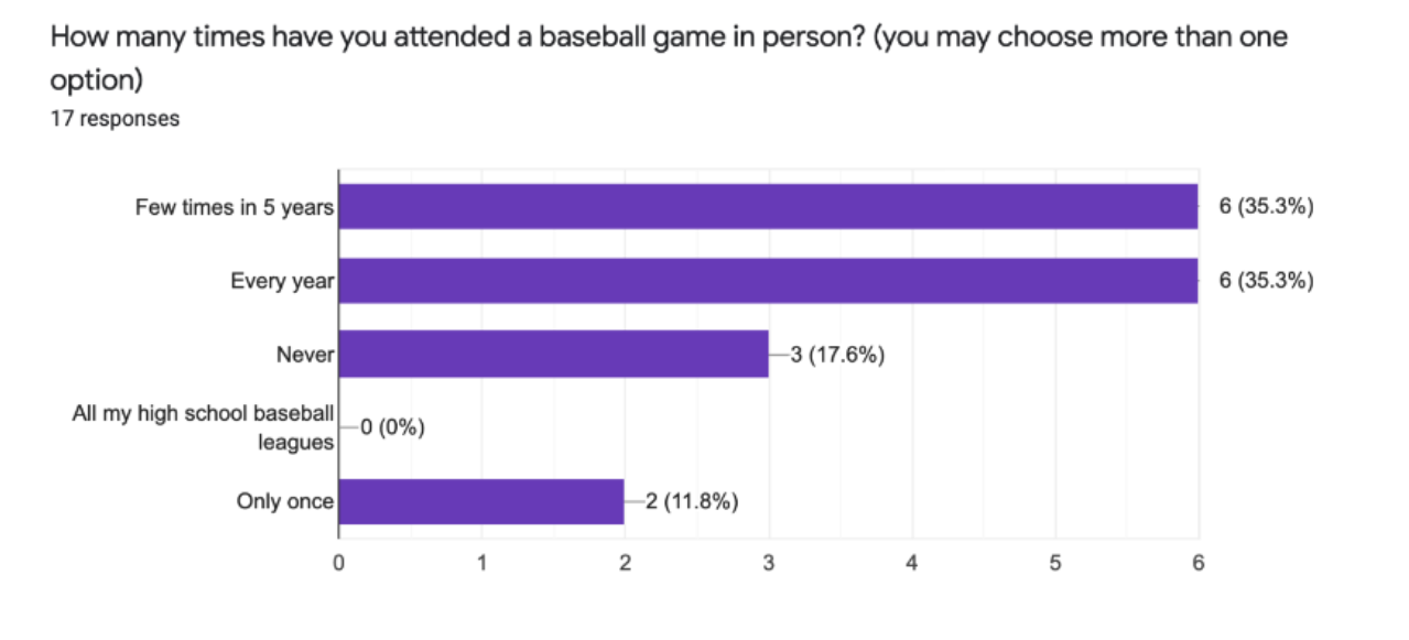
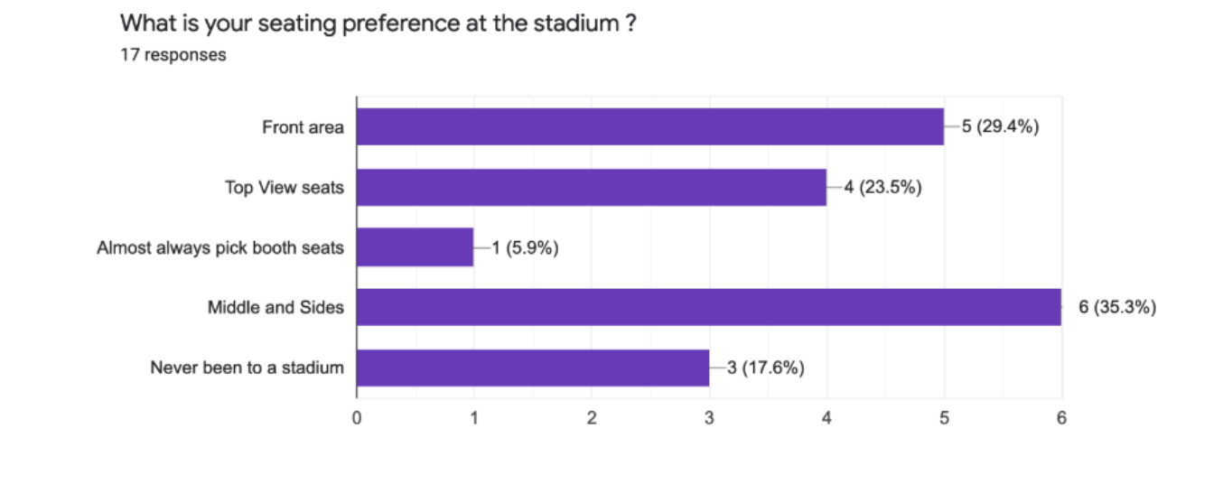
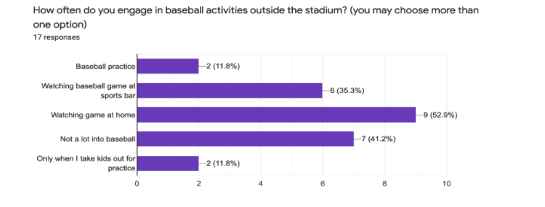
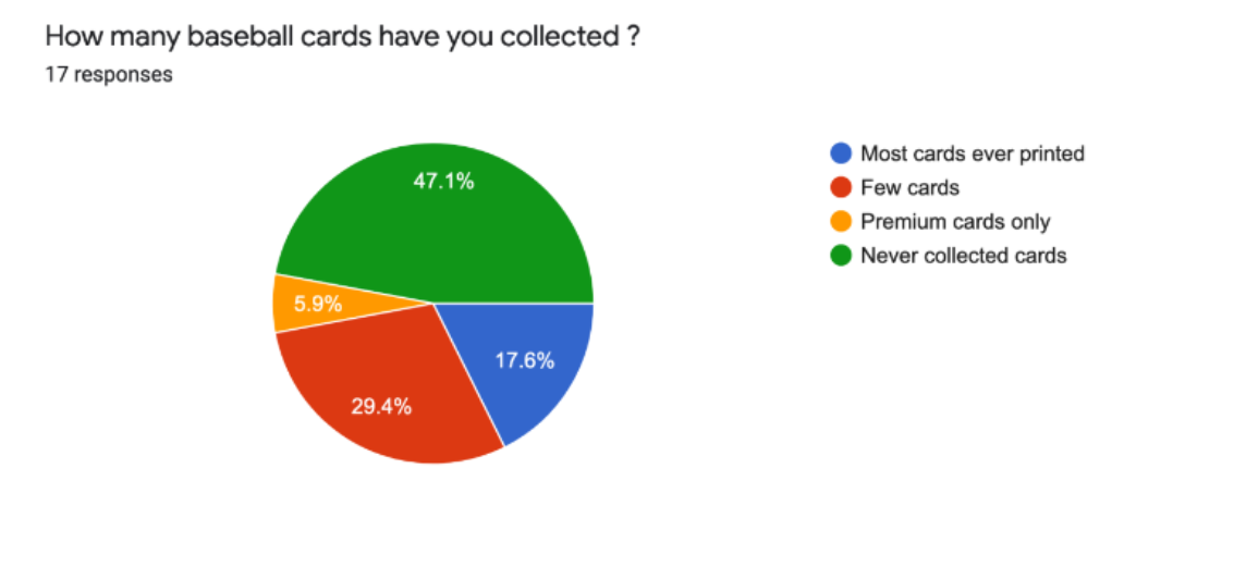
We conducted a 12-question survey to help us determine how we can cater our baseball app to users of various interests in the sport, preferences in attending the stadiums, and experiences in collecting baseball cards. We listed the survey’s introduction, interview questions, and interviewees’ responses below.
The 12 questions are:
Do you consider yourself a baseball fan?
How many times have you attended a baseball game in person?
What is your seating preference at the stadium?
How often do you engage in baseball activities outside the stadium?
How many baseball cards have you collected?
What would you be interested in knowing about the players?
Do you collect baseball cards from stadiums?
How often do you play baseball? Choose one or more below.
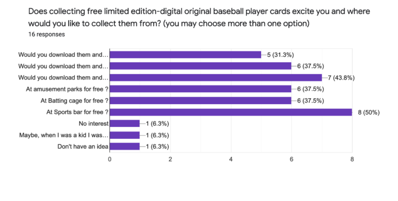
Does collecting free digital original baseball player cards excite you?
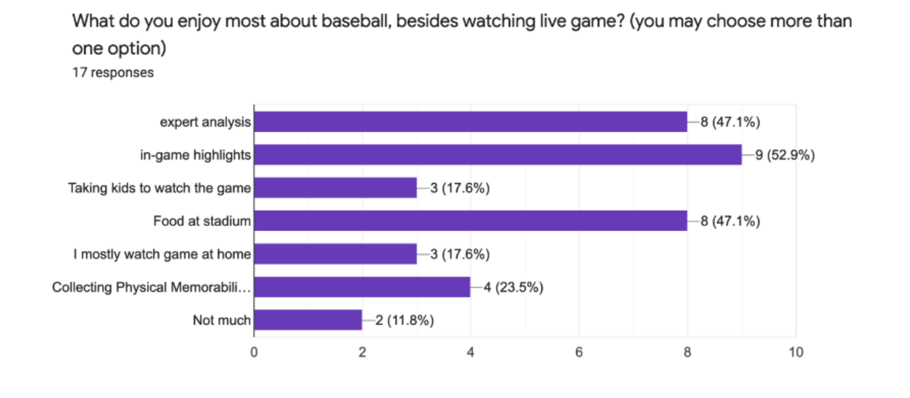
What do you enjoy most about baseball, besides watching live games?
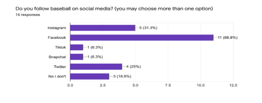
Do you follow baseball on social media? choose one more below.
(Optional question) Tell us about your favorite team or favorite baseball player?
Summary of the collected data:
Most users are watching games from home. There are more users who have collected player cards than those who have not. They are interested in knowing more about players. Most clients never played baseball, while some play the game with their kids. Additionally, the users prefer to watch the games at sports bars when they are not watching them live at the stadiums or comfortably at home. Facebook is the preferred social media platform to follow baseball, according to the survey.




10. Creating Personas
Figure 18: Primary Persona. Link to Primary Persona: https://miro.com/app/board/o9J_l05n9ic=/.
Figure 19: Secondary Persona. Link to Secondary Persona: https://miro.com/app/board/o9J_l05n9ic=/.
11. Testing Our Product Internally
The problem in script was that there was no explanation of what a QR code is and how to start the process of scanning one. We fixed these problems by describing QR codes and including a “first-time users demo” for the app when first signing up. All functions in our prototype are signing in/up, viewing profile, collecting cards, scanning QR codes worked, although edits need to be made for ease. We fixed problems by making the readability better, through changing the layout and editing buttons.
12. Updating Our User Flow
Figure 20: Before: Original Proposed User Flow. Link to the Original Proposed User Flow: https://miro.com/app/board/o9J_l3N-p8A=/?moveToWidget=3074457362368726100&cot=14.
Figure 21: After: Updated Proposed User Flow. Link to the Updated Proposed User Flow: https://miro.com/app/board/o9J_l1aNsys=/\.
The changes we made will improve the user experience by making it easier to navigate and also providing them with a sense of ease that their permissions are being asked (like when using the camera). We also included more features to drive engagement and added several more pages of what was missing in the previous user flow/ product ideation. We also added another flow where the user does not need to navigate through the app to start scanning, but can instead just open the camera, scan, and be directed to the app, this speeds up the process and gives options to users which way they prefer.
13. Design Iteration I
Assumptions that we had were that buttons were needed for most of our interactions. However, swiping or dragging elements is also very acceptable and might even be preferred as it imitates real life more.
Changes we made include making the UX more readable, and more in line with the MLB branding. We also made changes for security (such as camera access) and to make our product more engaging by adding in elements for our profiles, such as including the ranking of the user throughout the product so the user can easily see their progress and feel more inspired to continue collecting.
Figure 22: MLB Logo and Branding Color Palette. Colors from Left to Right: Shiraz; Lola; Tangaroa; Waterloo; Raven; Shuttle-Gray; Fiord; Pickled-Bluewood; Rhino; Black-Pearl
Figure 23: Before and After of QR Scanning
Improvements in our QR scanning are:
Included MLB logo and brand colors.
Added QR Code symbol and Assessing Camera and Help option.
Reason: MLB logo and brand colors is more aesthetically pleasing and memorable to MLB fans. The QR code symbol acts as a context clue for experienced camera users to use their camera. If users don’t know what is a QR code, the Assessing Camera and Help option will show them them how to scan a QR code.
Figure 24: Before and After of Card Library
Improvements in the Card Library are:
Grid layout of cards instead of “one slide per transition” slideshow.
User’s status, bio and collected points are visible.
Collection, Rank, and Saved Plays options are available.
Reason: Grid layout displays larger quantity of cards than the previous slideshow layout, making the process easier and quicker to spot the user’s desired cards.
Figure 25: Before and After of QR Scan
Improvements in information Architecture are:
Changed the single “profile” icon to a menu, with the user’s name and total points at the left of it.
Added additional information to our cards, instead of just a card image, we included writing above that describes what the card is and how many points the user will receive for it.
Reason: Having the information right away will also drive-up collecting incentives. It makes voice command easier for some users.
14. Narrowing Target Users and Market and Developing a Prototyping Plan
We shrunk the age range of 16-50 to 16-34 for the target users. Our main demographic of users are 13 to 34 years-old, who are tech-savvy and novice baseball fans. According to Statista.com, 51% of our clients are not fans of the sport ("MLB Interest in The U.S. 2021, By Age | Statista"). Although our product caters to all ethnicity and genders, our users are primarily white males (Allison and Knoester, "MLB Fans In The U.S. By Ethnicity 2020 | Statista"). We plan to primarily market our project to the United States. Our first-time users will gradually become frequent users. Our goal for our product is for our target users to use our product to collect cards, learn more about baseball, and become more engaged within the growing baseball community.
Prototyping Plan:
Testing Goals
Table 1: Testing Goals Table
Metrics For Success
The users are achieving their goals of collecting basic, metallics, and limited-edition baseball cards. They can achieve their secondary objective to reach optimum Collector Ranks. The ranks from highest to lowest with their benefits are:
All Star (Ranks 200+)
i. 3x points multiplier; ii. 4 strikes you’re out; iii. Premium Stadium Perk
Major League (Ranks 101 - 200)
i. 2x points multiplier; ii. Favorite Player Content; iii. Basic Stadium PerksMinor League (Ranks 51 - 100)
i. 1x points multiplier; ii. Special MLB News feed; iii. Monthly sponsor perk (i.e. October x2 points on Coca-Cola products)Rookie (Ranks 1 - 50)
i. No Perks
Marketing Opportunities:
The business reached their goals of sponsoring their athletes, selling stadiums’ tickets and merchandise, and keeping their 70-year partnership with Topps, a baseball card manufacturer before their contract finalizes in 2025 (Diaz, “MLB Is Ending Its 70-Year Partnership With Baseball Card Manufacturer Topps |National Public Radio”).
Tools for testing Trivia Mode and Voice Control:
The tool we will need to conduct Trivia testing is Amazon Alexa. Amazon Alexa allows us to conduct 3-question quizzes and graph the results of the users. Amazon Alexa enables users to take the quizzes by command and by touch. We can use Figma or Marvel POP to test the Ball Catching feature.
A description of the type of data we collected on our users’ path:
We were interested in the users’ visual, auditory, and physical interactions with our product. We designed the features of the product to match the design schemes of MLA Logos and MLB Ballpark app. We expected the users to receive audio feedback when they answered the trivia questions correctly and incorrectly. Additionally, we wanted our product to be handicap-friendly by allowing users to respond to questions orally. For our able-bodied clients, we want to see if the physical interactions run smoothly.
Users were getting the correct feedback during the experience when they receive positive and negative sound effects after completing the short trivia and ball catching game. We measured vestibular and proprioceptive feedback because the product has
AR experiences when the users are finding QR codes on commercials and in local stadiums, scanning their QR codes, and when they are catching virtual baseballs to collect digital baseball cards.
How we recorded our product's features that worked and did not meet our expectations:
We recorded features that worked and did not meet expectations by conducting surveys after major updates in the design. The results of the surveys will serve as guides to later iterations of the product design and development.
15. Risk Register
Figure 26-28: The Risk Register
16. User Testing I
For Testing Round 1, we asked our users to watch a a brief demo that demonstrate our product’s baseball catching game to collect virtual baseball cards after scanning the QR codes posted on commercials. Afterward, they will complete the Google Form survey for our record.
The demo is shown below:
Video 1: Demo of Scanning QR Code and Playing Catch Feature
The questions we asked in the survey are:
Can you describe what was happening in this video?
Have you ever given access to mobile camera while using an app?
Is there anything you like or dislike about this video?
Anything that confused you about this video?
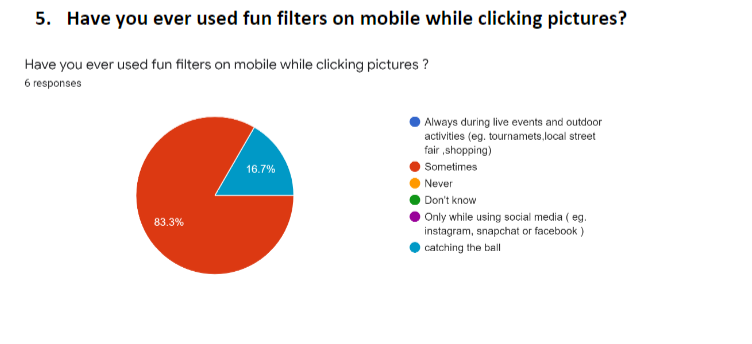
Have you ever used fun filters on mobile while clicking pictures ?
Have you ever clicked pictures with filters on mobile phone at outdoor events?
Have you ever used Augmented Reality (AR)?
Results:
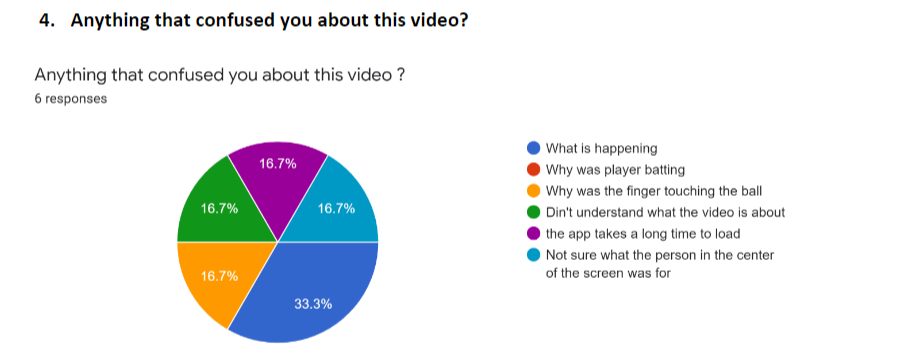
Based on the survey, most users had an idea of what our product was about but did not fully understand what the product is doing. They had experience with augmented reality, camera filter, and giving permissions to other mobile apps to use the camera.


17. Design Iteration II
We added a GPS system to find the location of the QR codes, a profile page, a QR code detecting page, and a home page.
Figure 29: Before and After of Card Library II
As shown in Figure 29, we edited the Card Library for our product again. The original design only allowed the user to redirect to the Home and Profile page after view the card collection. The card gallery was not in order. The user would have to scroll through the card slot to find the desired card.
The new Card Collection page allow the user to see an enlarged image of the selected card. Additionally, the user can select the recently collected cards located under the large photo. The user also has the option of navigating to the Home, QR Code, Profile, and Settings page.
Our changes improved the product by the paint points of searching through the app to navigate for certain scenes, trying to find the recently added cards, and attempting to stretch a fixed image of a card to read its information.
18. User Testing II
We asked the users to test our Figma prototype for our virtual baseball card collecting mobile application and complete a Google Form survey about their experience for the second round of user testing. A video of our prototype of the application, created in Figma, is provided below:
Video 2: The Figma link to the prototype:
We asked the following questions in our survey:
1. Can you describe what was happening in this app?
2. Have you ever given access to mobile camera while using an app?
3. Was this app easy to use?
4. Anything that confused you about this app?
5. What was the most confusing part/ screen/ word?
6. Could you read everything on app clearly?
7. What do you prefer, collecting baseball cards physically or virtually?
8. Did you see any player batting a ball?
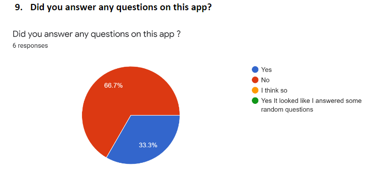
9. Did you answer any questions on this app?
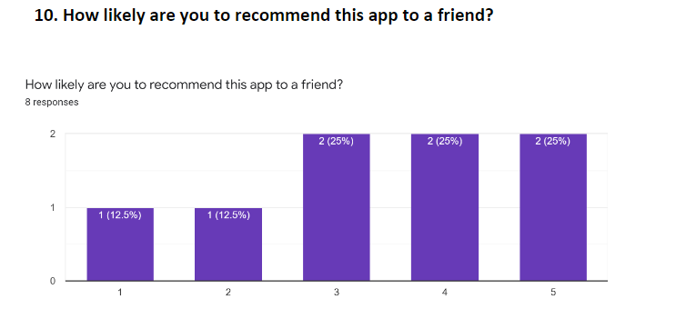
10. How likely are you to recommend this app to a friend?




19. Design Iteration II will make to the product are:
We added a setting page, sound button, sound effects, and titles for each screen.
As shown in Table 1, we edited the Ball Catching Game page for our product. The original design only had a fake Pitcher throwing a ball in an unrealistic direction. The hand signal is helpful but is hard to see in the background. The camera button is unnecessary for this interaction.
The new Ball Catching Game page allow the users to see an animated version of their favorite player pitching a ball to toward them. Additionally, there are indications to show if the users successfully and unsuccessfully caught the ball.
Our changes improved the product by making the ball catching feature easier to understand and see. The user can easier catch the ball when the background and button are not distracting the users. The Settings page is needed to cater the app to the users’ preferences. The screen titles help the users understand where they are in the app.
Figure 30: Before and After of the Ball Catching Game
Phase IV: Deliver
20. Storyboard and Storytelling
The storyboard we found to be the most inspiring is shown in Figure 1. The storyboard shows a user scanning a QR code from a stadium’s advertisement, playing an AR game, winning a virtual baseball card, and showing the prize to his friends, encouraging them to do the same.
Figure 31: Storyboard of Discovering the QR Code
You and your friends decide to go to a baseball game. While you are there, you notice QR codes scattered around the stadium. The game is a bit slow, and you and your buddies are getting a bit bored in between pitches, plus your team is losing so where’s the fun in that? You decide to walk around a bit and maybe grab some drinks. Then, you see the QR codes again and scan one. You’re brought to an app that allows you collect digital baseball cards! You decide to play the cool AR game to catch a card and succeed. Now you have a rare edition of your favorite player in your collection. Maybe this day wasn’t such a waste after all. You go back to your friends and show them your card. They decide to scan the QR code too and play for cards. Some of them receive a different card from you and try to get you to swap with them since everyone loves your card.
The character, the user, uses the product to collect baseball cards, increase the ranking in the app, and receive rewards. The product provides a community with baseball fans that collect and can trade cards and communicate with each other.
The XR in our product brings users together and they can sit together and trade cards. They can sit together in the living room when there is a pause in the game - and scan the QR codes and play for the card, along with traded cards that they got. The relationship between our characters and the product is that they enjoy using our product to be more engaged in the MLB community and can interact through the game of collecting cards and showcasing their ranks as baseball fans.
Result
The finished prototype in Figma is provided at this link. We created the 2-min trailer below to demonstrate the proposed mobile experience for MLB: Catch and Collect. Narrowing our targeted users' age range, using the company's brand colors, and basing our visual designs on the enterprise's previous products made our overall experience feel more familiar to our users. As a result, we were able to successfully demonstrate our product to our users and our client's stakeholders.
UX Writing: “Enjoy Collecting and Trading Digital Baseball Cards with Friends! Players can raise their ranking and become ultimate collectors for awards and inclusive MLB experience!”
Video 3: MLB: Catch and Collect Trailer
Video 4: MLB: Catch and Collect: AR Experience.


