24/7 Teach: Website Redesign
Client: 24/7 Teach
Industry: E-Learning Providers
Role:
UX Designer, UX Research, Visual Design, Mockup, Prototyping and Testing
Front-end Developer, HTML, CSS
Team Member(s):
Caitlyn Gilchrist, UX Designer
Tools: Adobe Creative Suite, Figma, Draw.IO, Excel, Google Forms, Excel, Squarespace, Hotjar
Programming Languages: HTML, CSS
Duration: April 2022-June 2022
Background
24/7 Teach is an E-learning organization that prepares teen, adult, and corporate learners with virtual courses and professional experience.
24/7 Teach provides services based on the following types of clients:
Teens: seminars for life skills; boot camps for career skills; career readiness programs for career preparation and professional development; college counseling and test preps.
Adults: boot camps for career skills; certificate programs for college alternative courses; parent workshops for homeschooling; teacher workshops for teaching skills.
Organizations: hiring of a 24/7 Superstar; managed internships; instructional design.
Overview
24/7 Teach: Website Redesign is a 3-month UX project of redesigning and improving the user experience and sale processes of the 24/7 Teach’s Landing and Product Page.
The goals are:
Promote business authenticity and customer retention by gaining positive reviews from former customers and converting new visitors to 24/7 Teach Learners.
Boost the Search Engine Optimization (SEO) of the 24/7 Teach website for more online visibility and lower advertisement costs.
Update the site's Information Architecture (IA) for easier navigation, error detection, and overall user experience.
Process
As shown in Figure 1, I divided the UX project into 4 phases: Discover, Define, Develop, and Deliver.
Figure 1: The Double Diamond Model
Phase I : Discovery
1. Problem Statement
I began the Discovery Phase of the 24/7 Teach: Website Resign project with the goal of attracting and converting the site audience into loyal customers. After researching the services provided by 24/7 Teach and learning about the target users of 24/7 TEACH learning platform, I developed the following problem statement:
“Based on the 24/7 Teach website’s recorded bounce rate, exit rate, and average time on page, site users do not understand the 24/7 Teach’s learning program enough to consider navigating the 24/7 Teach website and finding the information they are seeking. They dislike the length and user interface of the web page, causing them a bad user experience overall. Consequently, the negative user experience lowers the conversion rate of the 24/7 Teach website, decreasing customer retention.”
The problem statement addresses the direct relationship between UX-related problems of the Teen, Adult, and Organizational Learners and conversion rate of 24/7 Teach website.
2. Competitive Analysis
After completing the problem statement, I conducted a completive analysis of 24/7 Teach against popular E-Learning providers, General Assembly, Udemy, and Skillshare, based information architecture, user flow, and user journey.
2.1. Information Architecture
When designing the layout of the proposed 24/7 Teach website, I considered if the current 24/7 Teach website updated to the latest trends in information architecture, the organization of content on a digital product. Therefore, I compared and contrasted the information architecture of 24/7 Teach with General Assembly, Udemy, and Skillshare for their respective landing pages in the Comparative Information Architecture Chart, shown below.
Chart 1: Comparative Information Architecture Chart of 24/7 Teach, General Assembly, Udemy, Skill Share
Both informative and e-commerce websites have the purpose of informing and converting users. Informative websites, such as General Assembly and 24/7 Teach, are more concerned with informing, while e-commerce websites, such as Udemy and Skillshare, care more about converting viewers. As a result, the two types of sites differ on the importance of aesthetics and information on their pages. However, all four websites have a hierarchical content structure because it makes the digital products easier to navigate and scan for data. Since General Assembly and 24/7 Teach have the same type of web format, I continued conducting competitive analyses with General Assembly and rejected the information architectures of Udemy and Skillshare.
2.2. User Flows & User Journey Maps
Once I established that I would model the information architecture of 24/7 Teach after the one of General Assembly. I compared and contrasted the user flows of 24/7 Teach to that of General Assembly. Please note in Fig. 2 & 4, the bold words are links to new pages. The round rectangles are required steps, while diamonds are optional decisions.
Figure 2: User Flows of General Assembly Landing Page
Figure 3: User Journey Map of General Assembly Landing Page
As shown in Fig. 2, the web page will cause cognitive overload or frustration to new users because the page redirects the users to external links but does not summarize how the course will play out. Instead, the landing page focuses on payment plans and the benefits of completing the programs at the General Assembly. Therefore, in Fig. 3, The persona, Alexander Peterson, has a negative user experience (low altitude on the emotion arrow) scanning the landing page. The user needs to frequently open links under each section of the landing page to comprehend the landing page.
Figure 4: User Flows of General Assembly Landing Page
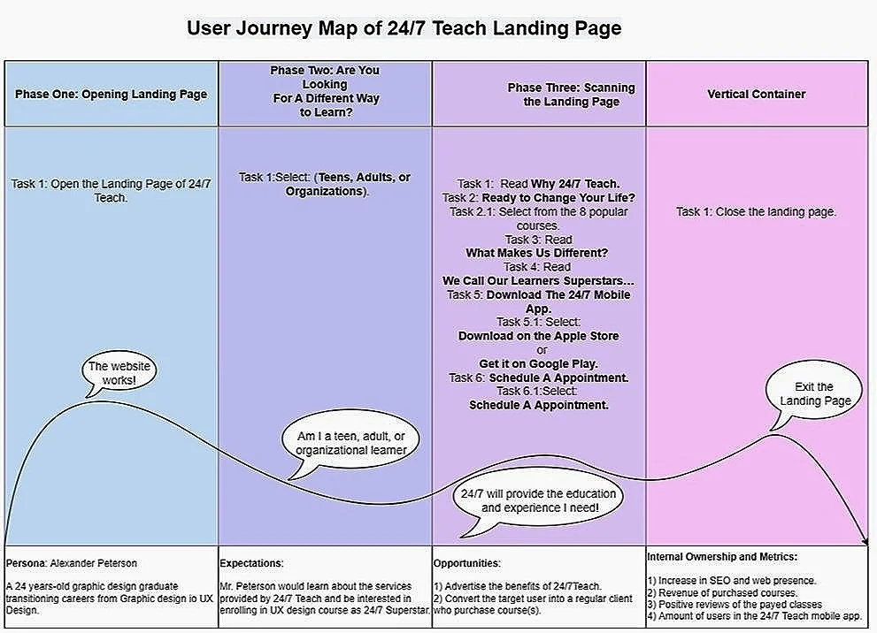
Figure 5: User Journey Map of 24/7 Teach Landing Page
Although 24/7 Teach’s user flows in Fig. 4 are similar to General Assembly’s, 24/7 Teach’s user flows explain the company's competitive difference from other learning platforms, provide sources for mobile apps, and allow the user to contact admission for further information about the provided courses. In Fig. 5, the persona, Alexander Peterson, has a positive user experience (high altitude on the emotion arrow) throughout the web page.
3. Website Evaluation
There are 5 types of adult and teen target users that use the 24/7 Teach website:
Adult 1: Adult looking to learn a new skill in order to change or advance in a career
Adult 2: Parent looking to purchase a course for their Teenager
Adult 3: School Representative looking to purchase Teen courses for their students
Teen 1: Teen who is eager to learn new skills not taught in traditional high school
Teen 2: Older Teen looking for a college alternative
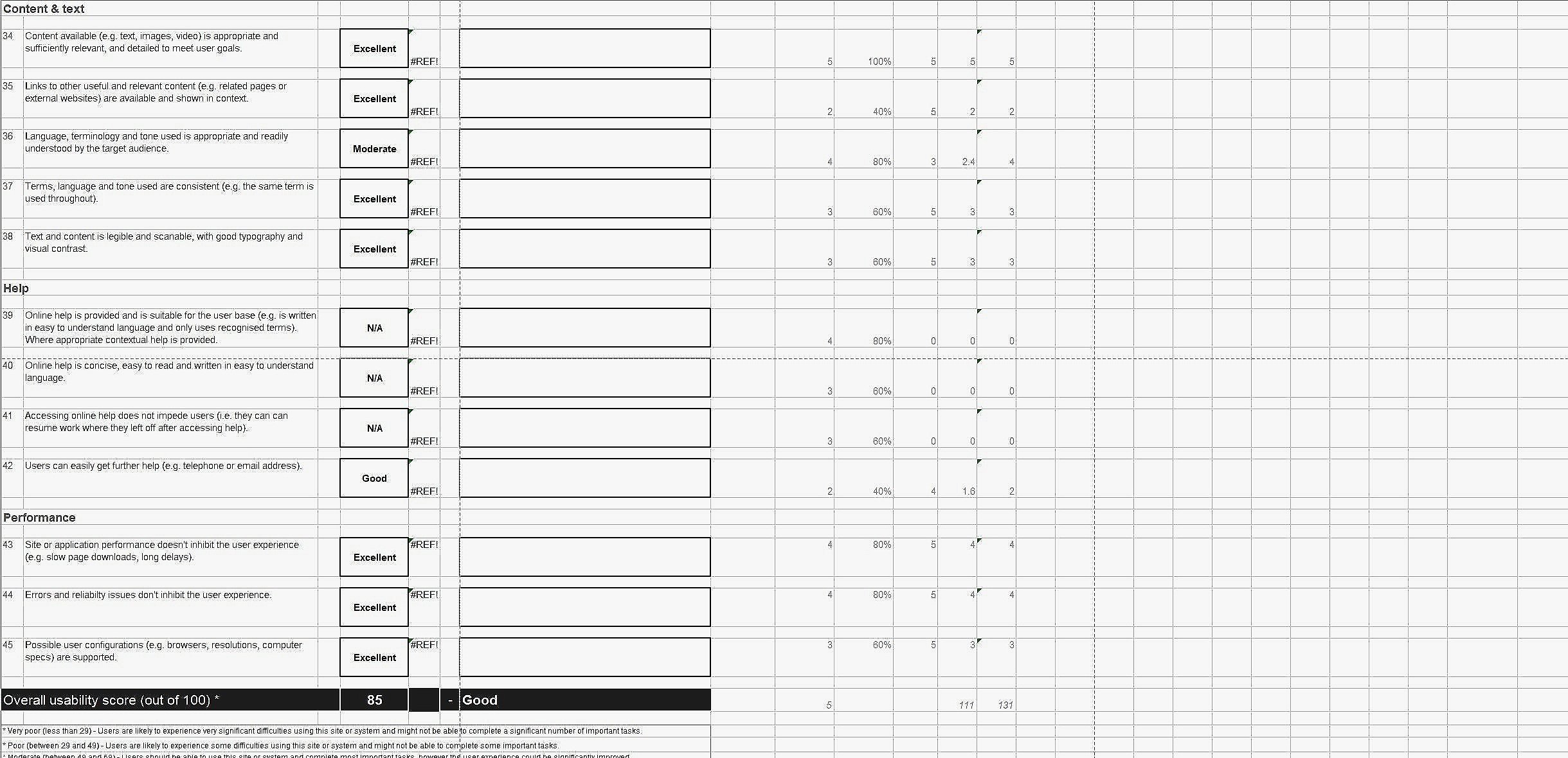
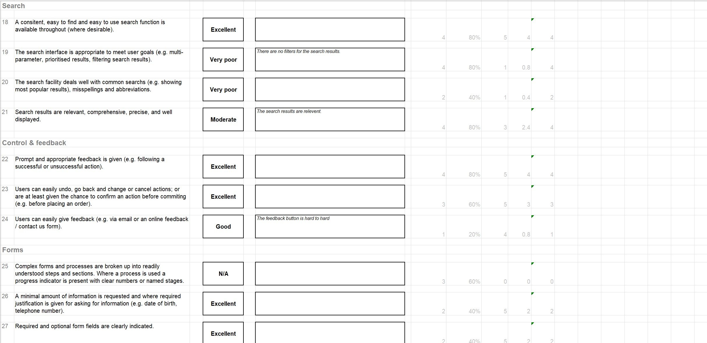
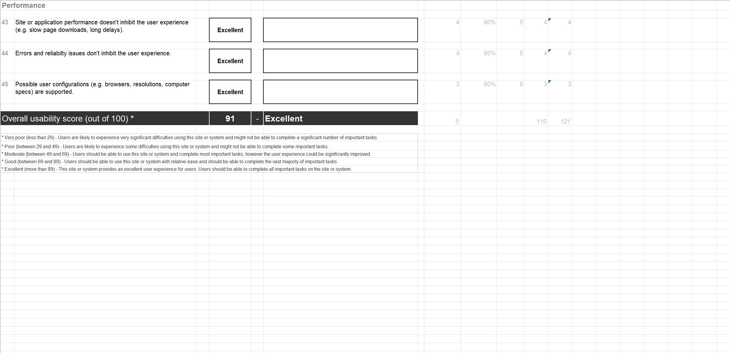
Web evaluations are necessary quantitative and qualitative user research methods in determining the end users’ overall user experience of a website. I gathered the web evaluations of 24/7 Teach website from Adult 1 and Teen 2 to determine the overall rate of the site’s functionality. The users graded the 24/7 Teach website based Features & Functionality, Homepage / Starting page, Navigation, Search, Control & Feedback, Forms, Errors, Content & Text, Help, and Performance.
3.1. Adult 1: Adult looking to learn a new skill in order to change or advance in a career
Overall Website Usability Score: 85/100 (Good)
Meaning: The website is relativity easy to use and enable users to complete a majority of their significant tasks.


Slide 1: Website Usability Evaluation from Adult 1
Adult 1 was the goal of learning a new skill to change or advance in a career. His Overall Usability Score is 85/100 because the user must wait for help on the website before proceeding on the page. The website does not have immediate assistance. The adult must email or call staff to receive aid. The search of the site takes a while to load. Once the search result appears, there is no filter for date and relevance.
3.2. Teen 2: Older Teen looking for a college alternative
Overall Website Usability Score: 91/100 (Excellent)
Meaning: The website has excellent user experience and enable users to complete all of their significant tasks.


Slide 2: Website Usability Evaluation from Teen 2
Teen 2 has the mission of finding a college alternate and a slightly higher Overall Usability Score of 91/100. Although the teen has the same help and search problems, the website provides all the information the teen would need to find the college alternative and contact administration, allowing the adolescent to fulfill their task faster.
Phase II: Define
1. Usability Survey
The web evaluations of the 24/7 Teach website from Phase I confirmed that the Features & Functionality, Help, and Search of the site needed improvements. I created the 24/7 Teach Landing Page Survey in Google Forms to determine which key areas on the website caused the users’ frustrations. In the survey, I instructed the target users to use the 24/7 Teach’s landing page and answer the survey questions.
The 6 survey questions were:
Have you heard of the 24/7 Teach website before this survey? If Yes, where did you hear about it?
Which category of service will you be interested in, "Teens", "Adults", or "Organizations"? Explain.
Is there a course in the “Ready to Change Your Life?” section that interests you?
Do you understand what 24/7 Teach is from the landing page?
If possible, is there anything you will like to see on the 24/7 Teach website?
Where are you viewing the website? (check all that apply)
Computer (laptop or desktop)
Smartphone
Tablet (Android/iPad/etc.)
Others
Screenshots of the Usability Survey’s Results
Conclusions from the usability survey are:
The majority of the participants were not familiar with 24/7 Teach before the survey.
Many participants knew which category they should go to without assistance.
The landing page did not display the courses of interest for most participants.
None of the users understood 24/7 Teach services from reading the landing page.
They would like a “Help” option to aid them through the page.
Most of the audience used their phones to view the 24/7 Teach website.
2. User Survey
To define the problem with the 24/7 Teach website, I conducted remote user interviews with the company’s target users, adults and parents. I asked the following 10 questions, which were based on the 24/7 Teach’s landing page, in the survey:
What sources do you use to find online course providers?
What services do you look for when you purchase an online course?
How often do you contact the administration before purchasing a course?
On a scale from 1 to 5, how much do payment, flexible learning schedule, and post-coarse career assistance affect your decision on your online course? And why?
What digital device do you use when completing online coursework?
Have you enrolled in an online course before?
I concluded the interviews with the following knowledge:
Google Chrome is the prime source of finding out about an online course for all users.
All users are considered career help after completing a course important.
⅔ of the users call administration before enrolling in the course, while the remaining user relies primarily on personal referrals/reviews from peers.
All the users rated payment/tuition, flexible learning schedule, and post-course career help as important
All users use laptops to complete their remote classes.
All users had experience using an online course.
3. Heatmaps and Sale Process
Caitlyn and I used a heatmap of the 24/7 Teach landing page to determine the elements that capture the most of the viewers’ attention.
Screenshots of the Heatmap of 24/7 Teach landing page
The heatmap tracks how the target audience interacts with the 24/7 Teach landing page during the last 30-day period. The blue signature presents the least popular elements on a website, while the red presents the most popular items on a webpage. According to the map, the users focused on the “Ready to Start Learning and Make an Impact?” section, “With the 24/7 Teach App you can learn offline, online, anywhere, anytime, and on any device.” segment, and “About Us”,” “Teen,” “Browse Courses and Programs” buttons on the landing page.
We fabricated the following sales process for 24/7 Teach based the heatmap:
View About Us - learning about the organization before exploring the site.
Browse Courses and Programs.
Class catalog (Reading Information boxes).
Find the preferred area of course.
Read about this program.
Use Chat Box or Call Admissions (optional).
Purchase/Register for a course.
Phase III: Develop
4. Wireframe and Mockup
I drew the wireframes and created the mockup of the proposed landing page in Figma below using the data gathered from Phase II.
Figure 6: My Hand-drawn wireframe Version of the 24/7 Teach Website
Figure 7: Figma Version of the 24/7 Teach Website Mockup
The wireframes and mockups tackle the following problems addressed in the usability survey:
The majority of the participants were not familiar with 24/7 TEACH before the survey.
Solution: Provide more description in the Are you looking for a different way to learn? section
Problem: The landing page did not display the courses of interest for most participants.
Solution: Display all the services for the Teens, Adults, and Organizational users.
Problem: They would like to see a “Help” option to aid them through the page.
Solution: A sticky Help option in the left of the page
Problem: Most of the audience used their phones to view the 24/7 TEACH website.
Solution: Provide a link to 24/7 Teach app for Android phones at the Log into 24/7 Teach via Browser section.
Phase IV: Deliver
5. Modify the Official Website
After completing the Phases I-III, we proceeded to modify the official website in Squarespace. In addition to correcting grammatic errors, removing unrelated data on the page, and improving the information architecture of the website, we modified some elements on the page.
Before: Are you looking for a different way to learn? & Why 24/7 Teach?
After: Are you looking for a different way to learn? & Why 24/7 Teach?
Changes to Are you looking for a different way to learn? & Why 24/7 Teach?: The Teens, Adults, and Organizations buttons describe the services and programs their respective users.
Changes to Why 24/7 Teach?: We removed the unnecessary icons, highlighted the unique benefits of 24/7 Teach service, and linked the sections the page enlisting all the programs provided by 24/7 Teach.
Before: We call our learners Superstars…
After: We call our learners Superstars…
Changes to We call our learners Superstars…: We enlarge the font so the elder audience see the quote better.
Result
The Finalized Redesigned 24/7 Teach Website
Before: May 2022 Bounce Rate
After: June 2022 Bounce Rate
Before: Squarespace Analytics of the landing page (Learn, Create, and Succeed) from July 6-Aug 4, 2022.
After: Squarespace Analytics of the landing page (Learn, Create, and Succeed) from July 31-Aug 4, 2022.
While monitoring the the progress of the redesigned landing page of 24/7 Teach (Learn, Create, and Succeed Page), we successfully discovered that the average time on page increased by 54.7%, bounce rate decreased by 21.7%, and exit rate reduced by 27.7%.
We discovered the impact of the 24/7 Teach with Squarespace website redesign. According to Squarespace, the bounce rate for a page is the percentage of visitors who entered your site on that page and then exited your site from the same page without visiting any other pages on your site. Exit rate is the percentage of views to a given page that didn't result in any more page views on your site.
The positive results from redesigning the 24/7 Teach’s landing page, detected by Squarespace Analytics, are:
Increased Time on Page by 54.7%.
Decreased Bounce Rate of the 24/7 Teach website by 21.7%.
Reduced Exit Rate by 27.7%.


